As an inspiration on how to layout my magazine I have looked at different magazines from a variety of areas (not just solely garden related magazines). I then made a mind map of characteristics I liked in the magazines I looked at and so came up with the type of magazine I was aiming to design.
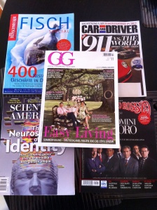
Some of the main magazines I looked at for layout ideas. They are all magazines ranging in price from 3-8 pounds (if converted to pounds); this being perfect considering I want to make my magazine more high budget and classy than the original magazine I started out with.
This in the minp map I made of things I noticed that I liked about the different parts of the magazines. How they used color, what kind and how they arranged the content, the layouts and the fonts. The details can be read in the image above.
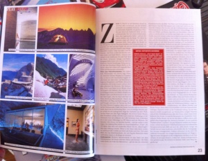
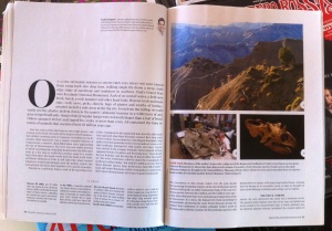
The three images above show some of the characteristics I seemed to be attracted to throughout the different magazines. Most of them had their text separated into two main columns. Also as the images above show the text can be slightly broken up by an image or quote placed central and then text wrapped. This gives the page a sophisticated look and lightens up the page, so that the text does not look to heavy and overwhelming.

 Another aspect of the layouts that appealed to my idea of a simply yet sophisticated magazine that would appeal to the people not only interested in gardens, but also the art and design in them, is spreads which have a whole page committed to one large image. On this image is then placed a caption and a small subtext.
Furthermore another very interesting was the aspect of collages or simply many smaller images on one page, with the text belonging to it on the opposite side. This layout works well for a visuals heavy magazine like I am planning on creating. Content can be brought to the reader without being too heavy. The images appeal to the eye and encourage the reader and awaken his interest in the feature.
These images show more layouts that have a number of images integrated into them, without being too fancy and complicated. They strictly apply to a grid and yet do not look too static at the same time. Especially when one lets the image bleed of the page as the top example.
These are examples of how on the index page special or more important features can be emphasized by adding an image, which catches the eye before one has even read the text. Also are they an example for how layouts for index pages could look.
This what I image the first spread of my long feature to look like, since it is a nice way of introducing the reader to the subject he or she is about to read about.


